1


Antonio Frasconi's (1919–2013) expressive woodcut style: elevating socio-political visual journalism into monumental graphic art by collaborating with the raw, tactile grain of the wood block; an American mid-century revival of the relief print.


1
100% Upvoted
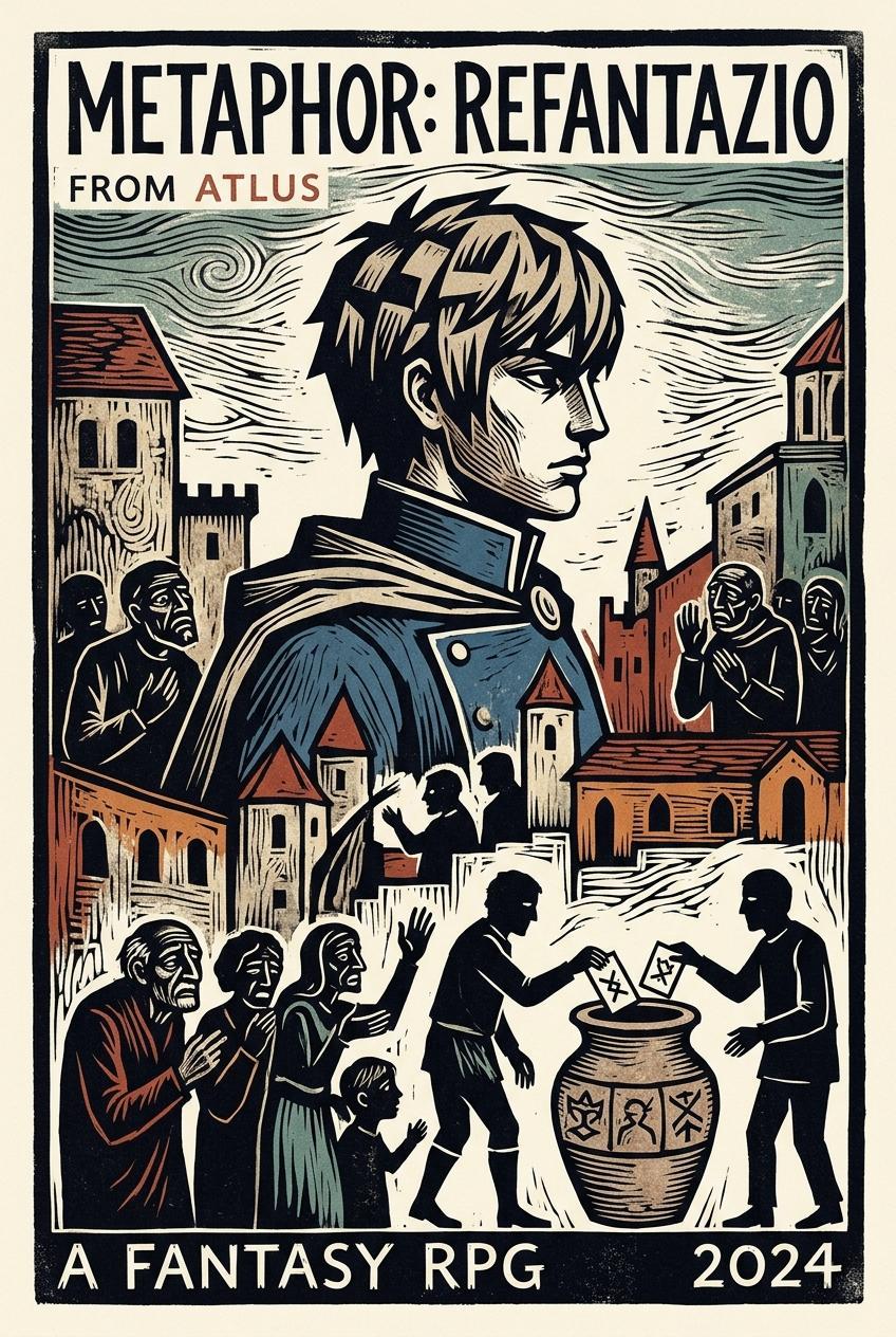
{"Metaphor: ReFantazio" (2024 video game)} illustrated in Antonio Frasconi's signature woodcut art style: {
Antonio Frasconi's (1919–2013) woodcut art style: elevating illustrative narrative into decorative fine art by collaborating with the raw, tactile grain of the wood block and aligning primitivist woodcut figuration with typographic semiotic precision and mid-century illustrative modernism.
Antonio Frasconi forged his artistic path by rejecting academic tradition in favor of a tactile, working-class engagement with his materials. Abandoning formal schooling for a printer’s apprenticeship in Uruguay, he gained a foundational understanding of ink and paper. Initially working as a satirical cartoonist, he absorbed the aesthetic of Mexican printmaker José Guadalupe Posada (1852–1913). These early works laid the groundwork for his lifelong conceptual framework: viewing graphic art as an accessible, "democratic" instrument of social resistance, rooted fundamentally in the visceral mechanics of the printing press.
Moving to the United States in 1945, Frasconi fully committed to the woodcut, drawn to its capacity for multiplicity. His emerging visual language synthesized diverse influences into a cohesive modernist style: the narrative visual flow of comic books, the emotive distortion of German Expressionism, and the monumental spatiality of Japanese Ukiyo-e masters. Crucially, inspired by Paul Gauguin’s (1848–1903) Post-Impressionist prints, he began treating the wood grain not merely as a substrate, but as a primary compositional collaborator.
In the early 1950s, Frasconi mastered the distillation of complex narratives into rhythmic, structural zones. In works like the Santa Barbara triptych (1951), he utilized juxtaposed surface patterns to extract structural extractions from agricultural landscapes. By inserting the artist’s own hands into the foreground, he established a reflexive 'mythopoesy' connecting artisanal printmaking to physical labor—grounding his 'material honesty' in the shared grit of the land and the carving tool.
Frasconi transformed social and natural observations into decorative, symbolic statements through primitivist figuration. As he pioneered the modern 'artist’s book,' he refined a visual shorthand of whimsical, robust silhouettes. This "faux primitivism" prefigured the stylized iconography of modern environmental storytelling. His graphic economy balanced structural "decorative reductivism" with editorial clarity, ensuring his compositions functioned with equal, monumental impact on a gallery wall or a mass-published page.
By the 1960s and 1970s, Frasconi’s technical repertoire expanded. He utilized rhythmic overprinting, visible wood grain, and flat, vivid linocut colors to envelop his subjects, paralleling the structural extractions of British modernists like Edward Bawden (1903–1989) and the toy-book aesthetics of Walter Crane (1845–1915).
Despite these decorative explorations, his commitment to art as a social weapon remained paramount. In his 1970s compositions addressing the Vietnam War and the Kent State shootings, Frasconi engineered a unique visual language of dissent. By rendering gruesome imagery through a palpable, heavily patterned graphic aesthetic, he pioneered a visually arresting, highly evocative political art that balanced palatable, unpretentious graphic boldness with profound thematic gravity.
Antonio Frasconi’s oeuvre functions as a vital bridge between the historical weight of European printmaking and the urgent, multicultural demands of the American modernist scene. Inheriting the expressive lineage of Francisco Goya (1746–1828), Gustave Doré (1832–1883), and the Post-Impressionist woodcuts of Paul Gauguin, Frasconi refined a style that was simultaneously ancient and avant-garde. This modernization of the woodcut parallels the stylistic evolution of mid-century illustrators like Al Parker (1906–1985); much as Parker adapted traditional realism into a streamlined, post-war modernism, Frasconi distilled the "crafty essence" of the relief block into a style defined by graphic economy. This synthesis resulted in an editorial-quality monumentality; his works possess a decorative power that functions with equal impact on a gallery wall or a printed page. This was achieved by masterfully balancing expansive narrative storytelling with a representative simplification—distilling complex human and natural events into their most essential elements through graphic forms imbued with letterpress charm. This strategy ensured that his work maintained the immediate clarity required for mass-publication while preserving the profound physical weight and permanence of fine art. He maintained the artisanal warmth of the hand-carved mark while embracing the bold, flattened efficiency of modern printing. This framework allowed him to negotiate the space between the technical meticulousness of Albrecht Dürer (1471–1528) and the structural "decorative reductivism" of Gerhard Munthe (1849–1929). Within this tension, Frasconi’s portraiture often utilizes a cel-shading-like play of shadow and light—defining facial volume through distinct, unblended tonal planes that bridge the gap between hyper-detailed rendering and distilled primitivism. Underpinning this precision is a distinct gestural undercurrent; Frasconi’s compositions often appear guided by a fluid, painterly logic, as if the relief carving follows the sweeping motion of an unseen underpainting. This creates an expressive gestalt where, even in his most densely patterned works, the eye perceives a unified, kinetic force when viewed from a distance. By marrying the "hard" relief cut with this "soft" gestural flow, he ensured his art never felt static, but rather pulsed with an illustrative life that resolved into powerful, cohesive movements across the plane. This technical proficiency is perhaps most evident in his portraiture, which traversed the spectrum from fine-lined realism to the raw, emotive distortion of German Expressionists like Ernst Ludwig Kirchner (1880–1938). He negotiated these disparate aesthetics—the precision of the Old Masters and the visceral energy of Modernism—without ever abandoning the wood-grain-inspired organic language that served as his conceptual anchor.
Frasconi’s visual language is a complex layering of historical and material echoes. His primitivist stylizations exhibit a diverse formal range: stretching from the fluid, calligraphic organicism of medieval manuscript illuminations to the raw, splintered rigidity of weathered timber and bark. This spectrum imbues his subjects with a visceral, nature-like expression, while his use of small-scale narrative symbols recalls the intimacy of traditional ex-libris motifs. This aesthetic choice was more than decorative; it functioned as a conceptual nod to the anti-industrialism of William Morris’s (1834–1896) Arts and Crafts movement. This commitment to artisanal honesty fundamentally dictates Frasconi's reliance on bold, distilled shapes; his blocky, robust stylizations are a conceptual byproduct of working within the physical resistance of the wood block. By embracing these bold silhouettes, he aligns his visual language with the manual kinesis of the relief process, celebrating the "honesty" of the tool’s cut rather than forcing the material into a false, mechanical delicacy. Each hand-pressed impression retains a haptic warmth reminiscent of traditional letterpress, where the vestiges of the carving—the visible grooves, splinters, and subtle irregularities—are integral markers of creation. In this framework, the bold shape and the rough grain work in tandem to reject the sterile uniformity of digital reproduction, transforming the print into a living record of artisanal labor. This grounding in artisanal resistance provided his modern social commentary with a sense of historical and human continuity.
Central to his graphic economy was the mastery of the paper’s negative space—a structural counterpoint where borderless, open compositions create a "breathing" spatiality. This premeditated breathing room allows complex narratives to be elevated into sacred mythopoesy while simultaneously accommodating the visceral behavior of his richly saturated pigments. Rather than obscuring the illustration, the resulting atmospheric ink-bleed—a soft, capillary feathering at the edges of the carved forms—engages in a deliberate material dialogue with the grain, providing a humanizing edge to his boldest silhouettes. Because his compositions are anchored in ample negative space, these organic ink-bleeds are allowed to settle without compromise, reinforcing the "material honesty" of the hand-inked block while surpassing the stark rigidity of traditional letterpress. This fundamental method of "cutting for light" transforms the relief process into a ritual of revelation, where the active excavation of the block strips away material to release the luminosity of the paper, imbuing his designs with a stencil-like immediacy and iconic charm.
A pervasive theatrical grandeur defines Frasconi’s narrative staging, wherein the deliberate amplification of aesthetic extremes—the sublime, the grotesque, or the absurd—elevates the mundane or the tragic into a heightened graphic spectacle. This visual dramaturgy ensures that his narratives are not merely depicted but performed through bold stylization within a flattened, temporal spatiality. Through primitivist distortion and a staccato application of marks, Frasconi injected a modern graphic tempo—a visual cadence that animates the static image. This pervasive organicity at times achieves a "destabilizing" effect, evoking a romanticized, dreamlike state of surreal perspective where jagged contours and motif-based woodcut surface patterning suggest temporal and spatial movements—reminiscent of the rhythmic dynamics seen in the work of Enid Marx (1902–1998) and Frans Masereel (1889–1972).
This spatial logic was further refined by a chromatic strategy that treated color as a structural subordinance to his monochromatic foundations. Frasconi utilized a limited palette to either create surgical accents—vivid highlights that anchor the viewer’s eye—or to apply atmospheric overprints. In the latter, he employed diluted, transparent washes that provided a desaturated vibrancy, subtly contextualizing the subject within a specific environmental or emotional mood without diminishing the graphic power of the primary relief cut.
Technically, Frasconi transformed the woodblock from a passive substrate into a narrative protagonist. He exploited wood grain not merely for texture but as a symbolic overtone, aligning the natural contours of the timber to emerge as surface patterning within narrative elements or as shifting atmospheric layers that parallel the allegorical force of nature. In this capacity, he utilized this material organicism as a neutral narrative device, one that imbued his subjects with a documentary-like weight. This stylization functioned with the iconic permanence of hieroglyphics, providing a sobering gravity to themes that might otherwise drift into mere whimsy or extreme emotional darkness. By rooting his imagery in the material truth of the wood, he allowed the medium to act as an objective witness, granting an evidentiary status to the narratives he carved. This organic sensitivity was counterposed by a rigorous foundation in typographic semiotics. His essential, minimalist use of display typography often utilized the structural rigidity of blocky, stacked woodtype or the expressive charm of whimsy lettering with undulating baselines. Drawing upon these traditional letterpress aesthetics, he showcased a precise understanding of graphic semantics, where the "hard" architectural precision of the letterform operates in rhythmic, dialogic tension with the "soft" organic irregularities of the hand-carved block.
Ultimately, Frasconi’s art is defined by a tension between provocativeness and affection. While his narrative compositions possess the visceral, confrontational urgency seen in the political posters of Branko Bačanović (b. 1952), they remain rooted in a deeply personal mark-making. His pattern rhythms do more than decorate; they set the narrative tone, capturing an intimate affection for his subjects. In Frasconi’s world, the signature woodcut style is a holistic ecosystem where typographic precision, Synthetist natural forms, and the "capricious" textures of the medium converge to serve as a witness to both the beauty of the natural world and the complexities of the human condition.
}