2


Esben Hanefelt Kristensen (b. 1952) is a Danish artist whose acrylic paintings adapt folk art ornamentalism into organic surface patterning to create a hyper‑romanticized view inspired by illuminated manuscripts, and to evoke sacred mythopoesis.


2
100% Upvoted
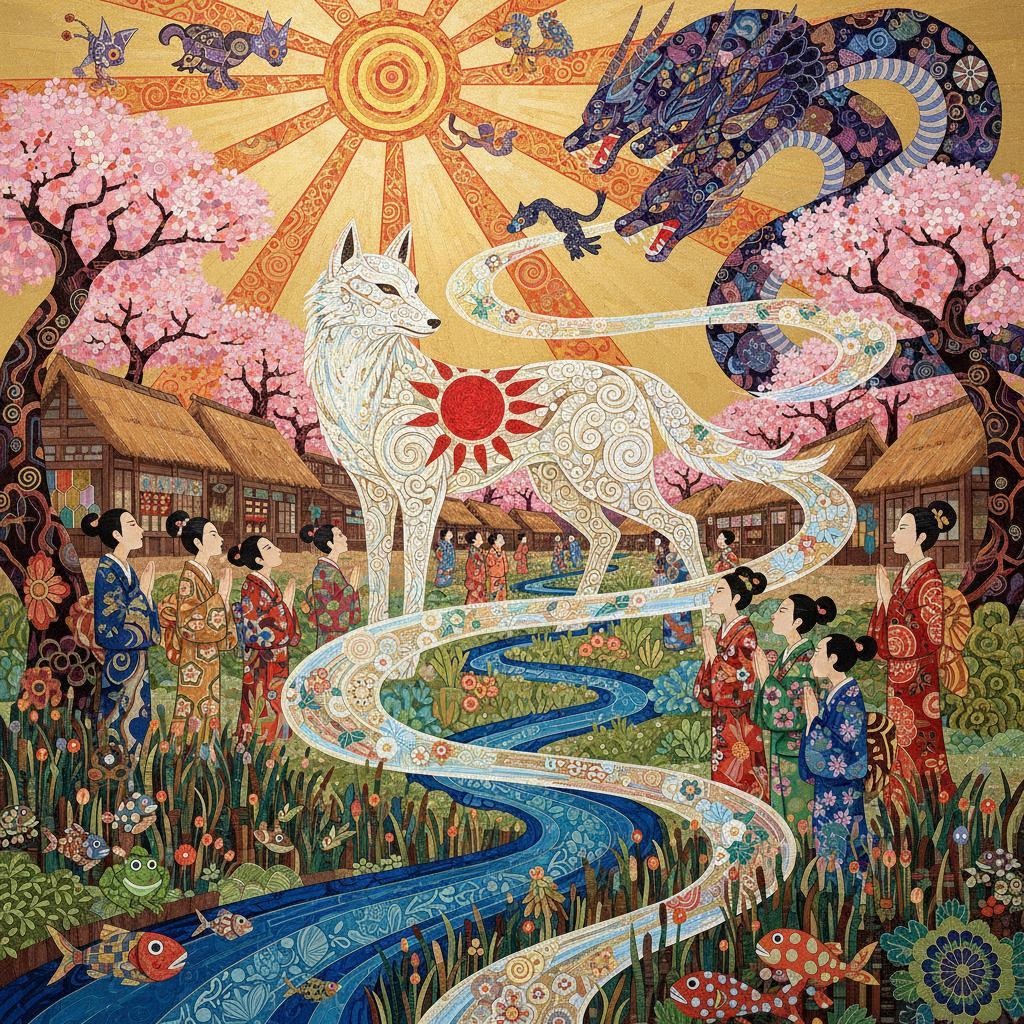
{Ōkami (2006 video game)}, illustrated in Esben Hanefelt Kristensen’s signature acrylic style of lyrical‑narrative maximalism: {
Born in 1952 in Nørresundby, Denmark, Esben Hanefelt Kristensen’s artistic journey began far from the structured worlds of classical academies. Growing up amidst the sweeping coastal landscapes of North Jutland, he initially pursued a career in education, balancing public school teaching by day with self-taught artistic experimentation by night. His early work leaned heavily into the nonfigurative abstractions popular in post-war Europe, making a formal debut at Denmark’s prestigious Høstudstillingen exhibition in 1972. These initial pieces were deeply influenced by Art Informel—a movement prioritizing tactile, formless impulses—and the kinetic, raw brushwork of Cobra artist Asger Jorn. This phase was critical, as it laid the technical foundation for his lifelong obsession with highly textured surface design.
A sudden artistic awakening in the early 1970s completely reoriented Kristensen’s trajectory. During a summer sojourn in Norwich, England, he sacrificed his family's modest clothing budget to buy a luxury facsimile of the fifteenth-century illuminated manuscript Très Riches Heures du Duc de Berry. The encounter was an epiphany. Kristensen instantly abandoned pure abstraction, pivoting toward highly detailed, monumental narrative illustration. His emerging style successfully synthesized three distinct historical worlds: the flattened, jewel-toned spaces of Piero della Francesca’s (c. 1415–1492) Renaissance frescoes, the crowded, micro-narrative chaos of Hieronymus Bosch (c. 1450–1516), and the tapestry-like graphic compositions of illustrator Harry Clarke (1889–1931).
This artistic shift gained profound spiritual weight when his father unexpectedly recovered from a terminal illness, subsequently leaving his career as a bank director to become a priest. This event infused Kristensen's worldview with deep theological meaning. Seeking to reveal the sacred within the everyday, he found his narrative scaffolding in biblical scripture, Hans Christian Andersen’s fairy tales, and the ancient chronicles of Saxo Grammaticus, populating his scenes with flawed, deeply human protagonists navigating a morally complex universe.
Upon first encounter, Kristensen’s canvases confront the viewer with an immediate, visceral impact—an ecstatic explosion of color reminiscent of celebratory fireworks bursting across the pictorial plane. This high-impact chromatic release functions as an instant phenomenological threshold, immediately transporting the spectator away from the muted, linear prose of mundane reality into a vibrant, otherworldly fantasy. This transportive energy captures the unmediated, lively magic of a classic children’s book illustration; yet, Kristensen elevates this intuitive wonder into a monumental, structurally rigorous cosmology that fundamentally rejects minimalist restraint. This visual journey transitions seamlessly from a state of raw, visceral confrontation to one of profound structural discipline. To master this ecstatic visual field and control a potential horror vacui (the fear of empty space), he relies on a sophisticated method of planar juxtaposition, placing distinctly patterned textures tightly edge-to-edge.
Crucially, despite his deep engagement with historical decorative traditions that rely on framing margins or ornamental borders, Kristensen strictly eschews applied decorative panelling. Rather than partitioning his scenes with secondary frames or enclosing borders—a method that traditionally segregates the frame from the central scene—he stylizes and enriches the narrative elements themselves. In this integrated approach, the figures, foliage, and beasts do not sit within an ornamental border; they are the ornament. The narrative subjects are internally vivified, turning the pictorial agents themselves into the sole vectors of decorative density.
Within this borderless framework, the idea of a mosaic reflects fluid linearity rather than rigid, fractured grids. It manifests as a continuous, meandering contour that weaves the entire composition together, where every surface plane is covered in folk-art motifs like starbursts and interlocking geometries. To bring this ornamental abundance to life, Kristensen employs a brilliant, high-saturation color palette. His intricate fragmentation of these hues recalls the monumental stained-glass art of Jan Willemen (1912–1985), who rhythmically applied radiant tones across complex patterns. However, instead of separating these vibrant fields with heavy outlines, Kristensen allows them to collide and interlock dynamically. This creates a rich optical dynamism reminiscent of M.C. Escher's (1898–1972) interlocking tessellations. Yet, where Escher's patterns are governed by strict mathematical logic, Kristensen’s are driven by organic intuition—fluid, asymmetrical, and rooted in the improvisational rhythms of folk-craft traditions.
In lieu of academic linear perspective, which relies on a traditional three-dimensional grid, the canvas is organized into stacked narrative strata. Disparate botanical, zoological, and human fragments sit side-by-side on a single, unified plane, shifting purely through variations in color value and pattern density. This specific strategy strongly parallels the visual richness of traditional Japanese paper collages like washi and chiyogami, where distinctly decorated fields are fluidly juxtaposed to create striking symbolic contrasts. This method of assembling contrasting textures simultaneously echoes the Modern British collage style of Mark Hearld (b. 1974), whose naturalistic illustrations rely on a dynamic arrangement of hand-cut, decoratively patterned papers to convey layered surface textures. While Kristensen's scenes are anchored by natural frameworks like dense reed-beds and horizontal waterlines, the transitions within these zones reject rigid dividing lines. By blending the structural repetition of British Modernism, such as the work of Edward Bawden, with the high-viewpoint spatial systems of Persian miniatures and the Japanese Rinpa school, Kristensen coaxes these meticulously detailed planes into a sheltered, self-contained world viewable through a hyper-romanticized lens.
Within these stratified frameworks, Kristensen executes an obsessive stylization using quick-drying acrylic paints and remarkably fine brushes. This technical discipline allows him to construct dense, raised micro-patterns that mimic the three-dimensional presence of hand-worked textiles, evoking the serene beauty of organic fractal patterns in nature. Every form is internally activated by an endlessly varying array of folk-art motifs reminiscent of traditional Indonesian batik or resist-dyed ceremonial fabrics. By substituting tiny, highly individualistic ornamental shapes for the uniform, rounded dots of traditional Pointillism, Kristensen creates a surface that vibrates with hand-wrought, artisanal energy. This deeply meditative, repetitive process echoes traditional Asian craft practices, transforming intense physical labor into a contemplative sanctuary.
This meticulous, layered application mimics the tactile relief of elaborate seed-bead embroidery, heavy brocade, or Byzantine mosaic tesserae, effectively transmuting each narrative element into a piece of exquisite Art Nouveau jewelry. This methodology echoes René Lalique’s (1860–1945) crystallization of flora and fauna into wearable, jewel-like enamels, where the raw vitality of nature is beautifully captured within an iconic, monumental aesthetic. Yet, far from rendering nature cold or static, this formal preservation serves a deeply devotional purpose. By magnifying the intrinsic rhythms and organic repetitions inherent in the natural world, Kristensen channels an attitude of childlike wonder. In his hands, the obsessive surface patterning ceases to be mere decoration and becomes a visual liturgy: an act of profound praise celebrating the beauty and revitalizing harmony of divine creation.
To temper this overwhelming decorative density, Kristensen masterfully orchestrates a visual balancing act by grounding his compositions in a frozen, meditative poise. He contrasts his rich visual noise—the raised micro-patterns, saturated vocabulary, and interlocking motifs—with pockets of absolute thematic silence. The figures stand in sharp, viewer-aware orthogonal profiles, adopting the iconic, flat postures of Egyptian hieroglyphs or medieval icons. Even the most high-stakes kinetic drama or narrative collision is paradoxically arrested, suspended within a timeless decorative vacuum. This tension between rich visual noise and absolute silence evokes the reflective elegance of illustrator Ted Coconis (1927–2023), alongside the theatrical, fairy-tale designs of his Danish predecessor, Kay Nielsen (1886–1957). Through this delicate balance, Kristensen transforms chaotic physical struggles and mythic conflicts into an ordered, sacred sanctuary of natural and narrative harmony.
Upon transitioning to full-time artistry, Kristensen secured major ecclesiastical commissions, most notably the thirteen-panel triptych altarpiece for Hadsund Church. Within this theological program, Kristensen completely rejects three-dimensional illusionism in favor of a stylized, faux-naïf spatial organization. He uses a vertically stacked perspective where depth is suggested through layered planes, graphic overlapping, and hierarchical scale, recalling both medieval Eastern Christian icons and Northern European Gothic predellas. Each panel is activated by a rhythmic, jewel-toned micro-patterning. This meticulous distillation of nature shares a striking aesthetic kinship with the mid-century modernism of Eyvind Earle (1916–2000), specifically his stylized, atmospheric designs for Disney’s Sleeping Beauty. Furthermore, the dense, unyielding flora and staring fauna evoke the dreamlike jungles of Henri Rousseau, while the interlocking planar forms partition the compositions to echo the luminous compartmentalization of medieval stained glass. Through this synthesis of structural discipline and folkloric innocence, Kristensen transforms biblical narrative into a romanticized cosmos where the natural and the divine are inextricably interwoven.
Operating at the intersection of optical illusion, sacred geometry, and pointillism, Kristensen constructs his narrative elements from distinctly folk-inspired, micro-patterned textures. Through the rhythmic modulation of fundamentally flat color planes, he achieves a state of intense optical vibration defined by shimmering, chromatic halftones. As these intricate, tessellated ornaments and highly saturated colors visually fluctuate against one another, they generate a glistening, slightly glittery overtone across the entire illustration. This optical alchemy dematerializes the heavy acrylic into an ethereal, light-catching surface.
This chromatic system mirrors the flat, non-illusionistic color palette of classical Japanese Ukiyo-e woodblock prints. By employing unshaded, hard-edged expanses of saturated yet chalky, mineral-like hues—such as deep indigo and Prussian blues, rich earth ochres, soft persimmon oranges, and brilliant cinnabar reds—Kristensen anchors his vibrating textures within a highly disciplined graphic field. Because the surface patterning moves far beyond mere colored tiles to feature brilliantly interlocking, Escher-esque geometric forms, the flatter the underlying color fields remain, the more powerfully these shifting, optical rhythms emerge to capture and guide the viewer’s focus.
This vibrating opticality shares a deep lineage with the tapestry-like density of William Morris (1834–1896) and the flat surface patterning of Gustav Klimt, yet Kristensen anchors this decorative intensity in a naturalistic Northern mythopoetic tradition. He infuses his canvases with a whimsical, slightly primitivist playfulness reminiscent of Bjørn Wiinblad’s (1918–2006) ornamental theatricality, coupled with a dense surface stylization that evokes both the impressionistic luminism of Marc Chagall (1887–1985) and the Mir iskusstva, or World of Art, folk-art ornamentalism of Ivan Bilibin. Through this intricately tessellated surface patterning, Kristensen generates poetically kinetic color rhythms, translating the hypnotic, swirling turbulence of Vincent van Gogh’s (1853–1890) iconic impasto strokes into his own flattened, meticulously detailed graphic language.
Ultimately, these diverse technical and historical threads coalesce into Esben Hanefelt Kristensen’s signature acrylic style of lyrical-narrative maximalism. Operating as a deeply mythopoetic folk art infused with an animistic, nature-worship aesthetic, his mature framework effortlessly elevates traditional illustration into monumental, sacred mythopoesy. This profound cosmological vision is achieved precisely through his dynamically juxtaposed surface patterning, where fluid, continuous lines of interlocking folk-art tessellations are perpetually enhanced by rhythmically luminous, flat color harmonies, leaving the entire canvas bathed in a glistening, otherworldly shimmer. By offering an intimate, microscopic perspective that speaks to the vastness of an idyllic whole, Kristensen’s romanticized imagery inspires a radiant sense of optimism and hope, leaving the mind suspended in a universe where life is endlessly flowing, cohesively integrated, and beautifully alive.
}