2


Branko Bačanović (b. 1952) propaganda poster design style. He was a pioneering first-generation Yugoslav graphic designer whose practice was tested and sharpened on the frontlines of the ideological poster warfare during the Bosnian War (1992–1995).


2
100% Upvoted
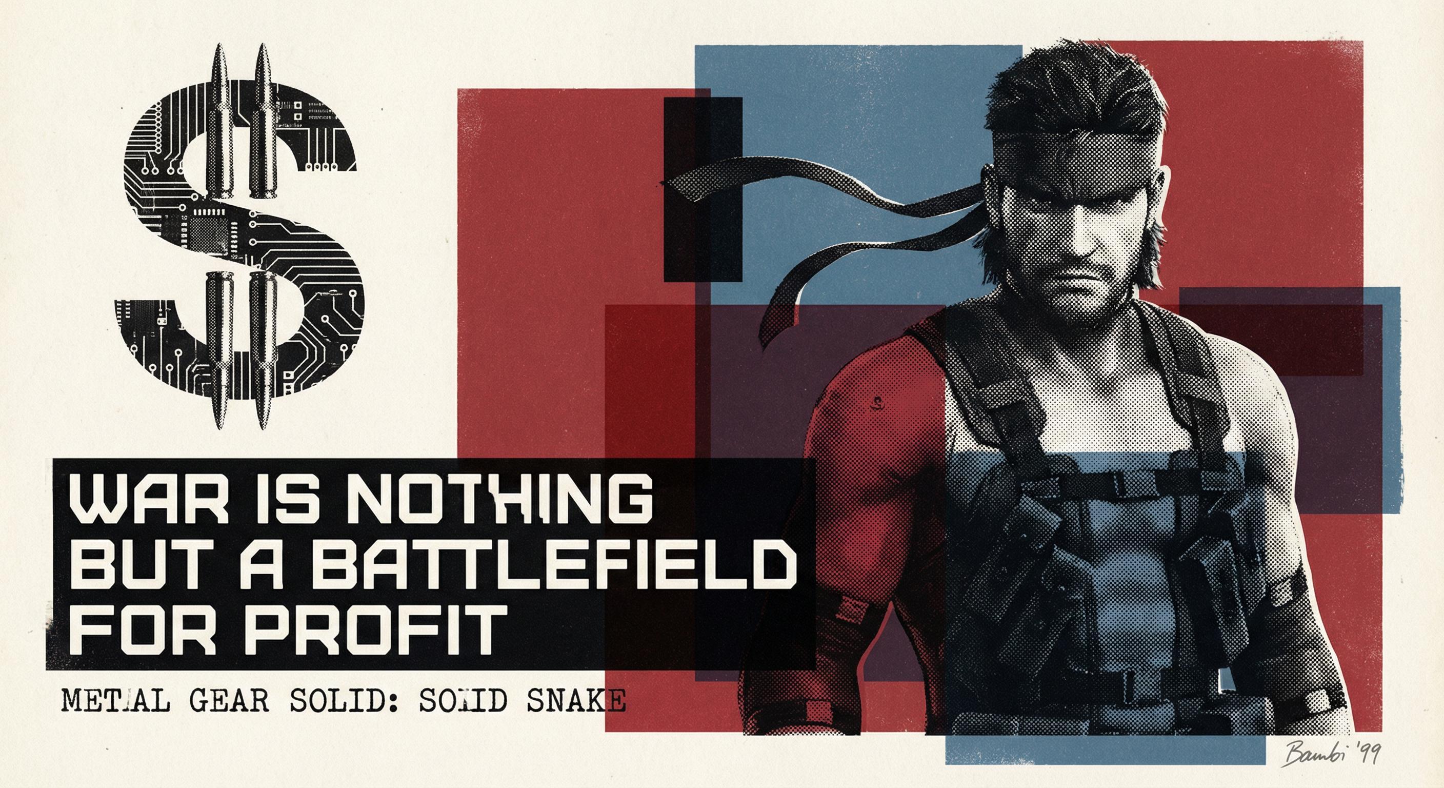
{Metal Gear Solid: Solid Snake — War is nothing but a battlefield for profit} conveyed in Branko Bačanović's (a.k.a. Bambi; b. June 14, 1952) signature poster design style: {
Branko Bačanović (born 14 June 1952 in Sarajevo, with familial roots in Montenegro) is a pioneering Yugoslav and Bosnian graphic designer whose four-decade career bridges the institutionalization of post–World War II Yugoslav modernist applied arts and the contemporary pursuit of visual authenticity in a post-conflict era. Elected a corresponding member of the Academy of Sciences and Arts of Bosnia and Herzegovina (ANUBiH) in December 2022, Bačanović has articulated an overarching design framework grounded in pre-digital, academically rigorous graphic modernism. His methodology reflects Georg Wilhelm Friedrich Hegel's (1770–1831) proposition that truth manifests as form, synthesized with Gillo Dorfles's (1910–2018) aesthetic philosophy—treating art, taste, and everyday life not as isolated formal problems but as integrated social phenomena. Situated within the "off-centre" or "eccentric" design tradition characteristic of the former Yugoslavia—an aesthetic strategy that deliberately departs from Western typographic conventions and established professional norms to produce provocative communication gestures—Bačanović pursues graphic design as a reflective and discursive practice: one that interrogates the nature of visual communication itself while translating complex socio-political and cultural narratives into highly legible, conceptually cohesive visual semantics. He achieves focal intensity by granularly deconstructing and recontextualizing the stereotypical use of graphic elements and references, yielding collage-like compositions in which each visual component carries deliberate contextual weight.
Enrolling in 1973 and graduating in 1977 as part of the pioneering graphic-design cohort at the Academy of Fine Arts of Bosnia and Herzegovina, Bačanović established his visual lexicon during the broader cultural momentum of pre-war Sarajevo. His foundational practice was deeply shaped by pre-digital production techniques—principally screenprinting and lithography, supplemented by fine-art printmaking methods including linocut—which instilled a rigorous discipline of spatial organization and graphic precision that would remain central to his compositional method.
His early work demonstrates a systematic adherence to the theoretical grounding articulated by Yugoslav graphic designer and professor Dževad Hozo (1938–2020), prioritizing clean visual flow and absolute typographic legibility. Yet this structural clarity served not as an end in itself but as disciplined scaffolding for a more subversive compositional agenda. Although not documented as a direct pupil of the Polish Poster School, Bačanović's career-long specialization in "posters in culture"—posters for theatrical, cinematic, and musical institutions—shares that tradition's fundamental tenets: the prioritization of a metaphorical, painterly approach over corporate-minimalist neutrality, and the elevation of the poster to a high-art form capable of social and philosophical commentary. Hozo's legibility principles thus functioned within Bačanović's practice as the structural prerequisite for provocative visual metaphor—ensuring that the viewer could parse the poster's graphic architecture rapidly enough to be confronted by its conceptual content.
Bačanović applied this synthesis across an expansive array of cultural institutions, creating production posters and comprehensive visual identities for the Chamber Theatre, the National Theatre, and the Youth Theatre, as well as for stage directors including Ivan Fogl and Slavko Šantić and playwright Gradimir Gojer. His practice was not confined to graphic design in a narrow sense: he imbued it with elements drawn from theater, film, literature, and music, and reciprocally enriched those domains with the fruits of his graphic work. Shaped by the artistic household of his father, Milivoj Bačanović (1921–2012), a celebrated baritone of the Sarajevo Opera, he brought a refined artistic asceticism—derived from the discipline and sensibility of musical performance—to his designs for the Sarajevo Philharmonic Orchestra and the Opera and Ballet of the National Theatre, including productions such as Nabucco (1987). This musical formation is perceptible in the rhythmic structuring of his compositions, where visual elements are sequenced and counterpointed with a cadence analogous to musical phrasing. His disciplined elegance prompted leading cinematic figures—including Emir Kusturica (b. 1954; Do You Remember Dolly Bell, 1981; Father on a Business Trip, 1985) and Vefik Hadžismajlović (1929–2014)—to align their films' promotional aesthetics with Bačanović's distinctive visual language.
His commission to design key components of the visual identity for the 1984 Sarajevo Winter Olympics—including the Manual of Graphic Standards, the ticketing system, and the Olympic Museum identity—demonstrated his capacity to modulate the high graphic focality of regional poster art toward the restrained register of global-audience communication. He strategically adopted a geometrized color-blocking consistent with International Style / Corporate Modernism, maintaining a profound, memorable impression without sacrificing modernist restraint. Subsequently, during his tenure as chairman of the Association of Visual Artists of Applied Arts of Bosnia and Herzegovina (ULUPUBiH) from 1988 to 1990—on the eve of Yugoslavia's dissolution—Bačanović occupied a pivotal position at the intersection of professional advocacy and the rapidly shifting political landscape of late-Yugoslav cultural policy.
The dissolution of the Socialist Federal Republic of Yugoslavia (1991–1992) and the subsequent Bosnian War (1992–1995)—driven by nationalist power struggles that instrumentalized fearmongering ethnic-identity politics—precipitated a radical shift in Bačanović's visual strategy. With conventional mass-media infrastructure systematically destroyed, the physical poster reclaimed its post–World War II role as a primary, fiercely contested medium for public communication and ideological warfare. Produced cheaply through screenprinting and lithography, posters could be disseminated rapidly across urban surfaces; the act of posting itself became a form of territorial contestation as opposing sides fought for the most visible sites.
In this landscape—saturated by divisive, religion-stereotyping propaganda rooted in Soviet-style visual manipulation techniques that had permeated Central and Eastern European political communication since the post-war period—Bačanović mobilized his graphic practice as a form of critical resistance. Aligning with Mersad Berber's (1940–2012) conception of art as an attempt to clarify existential truth and with Ismar Mujezinović's (b. 1942) principle of art as anti-populist social play, his wartime posters sought to provoke critical thinking and visceral emotional immediacy rather than serve commercial or populist appeal. Intensifying his long-standing affinity with the Polish Poster School—whose metaphorical approach to the poster as socially engaged high art had informed his practice since the 1970s—his wartime compositions employed bold, highly legible typography, stark symbolism, and wry black comedy to subvert nationalist narratives. He juxtaposed visceral imagery—bullet holes, blood—with pointed historical analogies, including Serbian-nationalist slogans set against the Nazi swastika, leveraging pop-cultural references, catchphrases, and bitter cynicism to expose the hypocrisy of the conflict and shape international opinion.
Bačanović's post-war oeuvre represents a conceptually cohesive synthesis of his pre-digital modernist formation and his wartime radicalization. Rather than reverting to pre-war conventions or recycling the familiar shock tactics of conflict-era poster production, he developed an unexpectedly fresh compositional strategy—retaining the graphic focality and ferocity of his wartime work while fusing it with the geometrized, color-blocked streamlining of late-1970s and 1980s Corporate Modernism and the rebellious, viscerally accentuated shock of 1950s French New Wave cinema. His continued engagement with operatic and theatrical institutions—exemplified by designs for productions such as Ero the Joker (2004)—sustained the musical-rhythmic compositional sensibility first cultivated through his father's influence, now deployed within his mature, post-war visual language.
Central to this mature methodology is what can be termed productive skepticism—a permanent, iterative interrogation of whether each element of graphic construction could be made more functional, more conceptually resonant. Bačanović approaches each project as a deliberate compositional gamble, dismantling and reassembling graphic elements to discover configurations that transcend their conventional significations. His practice treats cultural and everyday subject matter not as content to be literally illustrated but as raw material for symbolic abstraction—stylizing and recontextualizing referential elements into a graphic language that carries almost ceremonial weight.
His compositional technique operates with linocut-like precision in the allocation of discrete visual elements within defined graphic zones, producing collage-like assemblages in which each granular component carries specific contextual associations. A signature mechanism of this method is the embedding of realistic halftone photographic prints—reproduced through screenprinting or lithographic processes native to his pre-digital practice—within fields of symbolic abstract composition. The halftone image functions as a documentary anchor, carrying the indexical weight of recognizable reality (a face, a gesture, a material texture), while the surrounding abstract architecture—geometrized color-blocks, typographic interventions, graphic symbols—recontextualizes that reality through juxtaposition and framing. The representational fragment is thereby estranged from its original referential context and absorbed into a new semiotic field, where its legibility as a real-world referent generates productive friction against the symbolic abstraction that encloses it. This tension between photographic indexicality and graphic symbolism is the primary engine of Bačanović's visual semantics: the halftone grounds the composition in lived experience while the abstract scaffold transforms that experience into critical commentary. The resulting sensuously deliberate attention to graphic surfaces transmutes individual references into perspectives on broader narratives, yielding compositions that reward both instantaneous gestalt recognition and sustained semiotic reading.
His stylistic vocabulary seamlessly integrates diverse influences: the rhythmically layered, screenprinted colors and shapes of Boris Bućan (1947–2023); the symbolic high-contrast juxtapositions of Slovene graphic designer Matjaž Vipotnik (1944–2016); and a strong, fashion-editorial silhouetting that subtly echoes the saturated theatricality of David LaChapelle (b. 1963). The halftone-within-abstraction technique aligns Bačanović with a broader Central European poster tradition of integrating photographic and graphic registers, but his treatment is distinguished by the degree to which the abstract framing actively destabilizes—rather than merely decorates—the photographic content. While he shares the academic elegance and intense intentionality of his peer Čedomir Kostović (b. 1952), Bačanović's compositions break visual stereotypes through far more unexpected, experimental disruptions—deploying the interplay of realistic photographic fragments and basic graphic elements to achieve strong abstract evocativeness with subtle narrative referencing.
By recontextualizing and harmonizing graphic elements—anchoring symbolic abstraction in halftone documentary immediacy—to subtextualize critical commentary, destabilize stereotypical narrative constructs, and evoke open-ended questioning, while sustaining evocative emotional coherence through precise visual semantics, Bačanović secures his legacy as an architect of deeply resonant visual messaging whose striking abstract evocativeness transcends commercial graphic design.
}